File:Figure 1- Efficient Frontier Graph.jpg: Difference between revisions
Jump to navigation
Jump to search
Kevinpan156 (talk | contribs) No edit summary |
(No difference)
|
Latest revision as of 20:09, 28 November 2021
The x- axis represents the standard deviation of the data, which is also known as the risk tolerance. On the y- axis is the expected percent return. The points near the solid line are optimal, which is also known as the frontier line. Any points that fall below the curve are considered to be nonoptimal. This is due to the fact that with the same risk tolerance there are better expected returns. This method has its limitations as it relies on past data.
File history
Click on a date/time to view the file as it appeared at that time.
| Date/Time | Thumbnail | Dimensions | User | Comment | |
|---|---|---|---|---|---|
| current | 20:09, 28 November 2021 | 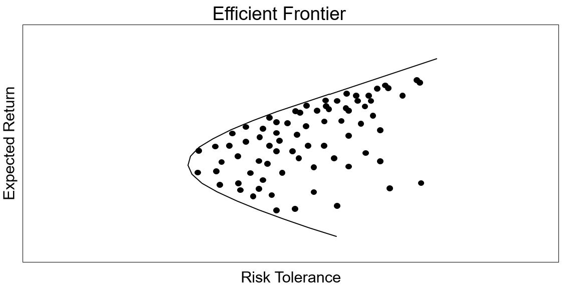 | 1,153 × 573 (48 KB) | Kevinpan156 (talk | contribs) |
You cannot overwrite this file.
File usage
The following page uses this file: